


There's a version of this pattern you already know. It's on the umbrella your grandmother kept in the hall closet. It's on the dress Minnie Mouse has worn for eighty years without changing her mind once.
That version is not what this is about.
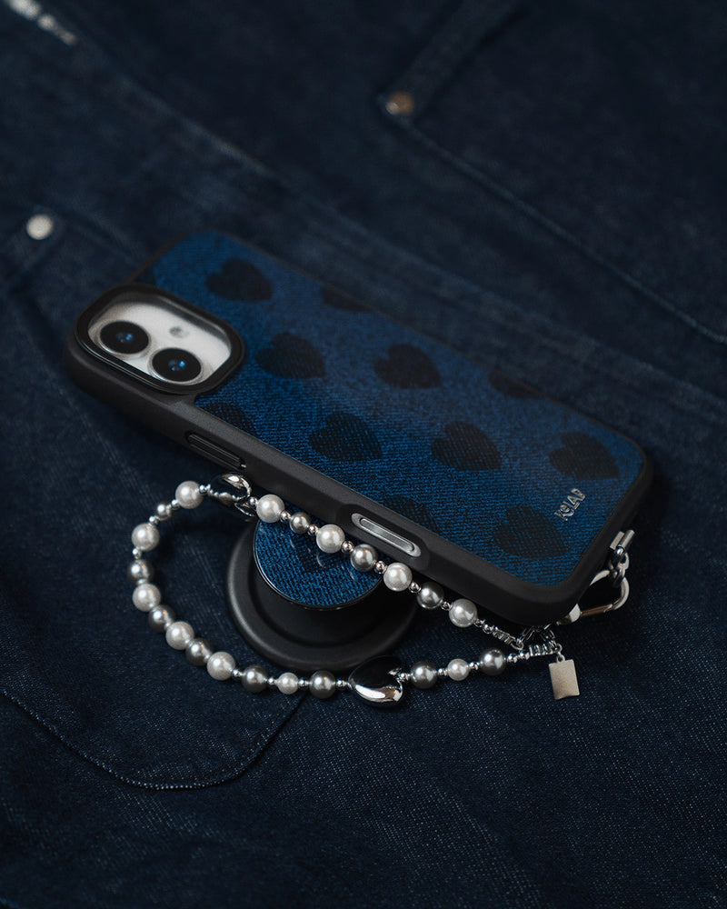
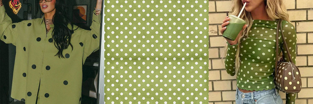
The dot came back in 2026 wearing different colors. Forest green on white. Burgundy on camel. Chocolate on ivory. The geometry is the same. The argument is completely different.


Why Polka Dots Are Back — And Why 2026 Is Different
Polka dots never really left. But they were living in the wrong decade. The version we'd all quietly retired was the cheerful, primary-colored, retro-cute dot — the kind that came with a basket bag and a full 1950s narrative attached. That one needed a rest.
What's back now is something else. Christian Siriano's Spring 2026 show at New York Fashion Week sent out silhouette after silhouette in dots. Vogue named 2025 the "Summer of Subverted Polka Dots." And the subversion is the point: the dot is being stripped of its nostalgia and rebuilt as a modern graphic tool. Cleaner. Sharper. More deliberate.
The color palette shifted too. The 2026 dot moment isn't red-on-white or bubble-gum pink. It's chocolate brown on butter yellow. Washed denim on faded ivory. Deep burgundy against warm camel. And — this is where it gets interesting — forest green on white. An unexpected pairing that reads earthy and precise at the same time. Organic and geometric. That tension is exactly what makes it work.


The Smartest Entry Point Into The Trend
You've been spotting it everywhere lately. On the bag at the table next to you. In someone's hand at checkout. On the phone screen of the person across from you on the train.
Here's the thing about committing to a polka dot moment: a full polka dot outfit is a decision that requires confidence, styling knowledge, and frankly, the right morning. Not everyone wants to walk into a meeting in head-to-toe dots.
But your phone is the one thing you carry every single day. It's in your hand at the coffee shop, on the table at dinner, photographed more often than most things you own. It's the accessory that gets the most visibility without ever being part of the outfit conversation.
That's exactly why a green polka dot phone case is the most considered way to join this trend. Not a commitment. An edit. You bring the dot without building an entire look around it. And when the dot is green — earthy, quiet, precise — it doesn't announce itself. It just makes everything else look more deliberate.
Sage Green vs Olive Green: Which Shade Is More Versatile?
Green is not a monolith. The difference between sage and forest is the difference between a linen blazer and a waxed canvas jacket — same family, completely different argument.
Sage green reads cooler and softer — a slight grey undertone that sits alongside cream, dusty pink, and lavender without effort. It photographs well in natural light, which is why it keeps appearing as the effortless daily carry choice. If your wardrobe skews light and minimal, sage is the answer.
Olive green runs warmer and deeper. It grounds earthy neutrals like camel, rust, and chocolate brown. Think trench coat season, weekend market, vintage denim. If sage is morning light, olive is late afternoon. If you gravitate toward warm tones and layering, olive works harder for you.
Both are far more wearable than brighter greens, which have a narrower pairing range. Here's how to navigate the full spectrum:
| Green Tone | Mood | Best Paired With |
|---|---|---|
| Sage / Muted | Soft, botanical, understated | Cream, oat, soft beige, terracotta |
| Urban Sage / Forest | Confident, earthy, editorial | White, navy, tan leather, raw denim |
| Pistachio / Pale | Delicate, unexpected, playful | Soft pink, dusty rose, warm white |
| Olive / Khaki | Functional, considered, gender-neutral | Stone, sand, military canvas, brown |
One Principle. Three Applications.
The polka dot follows a single rule: let it be the thing. Everything else in the outfit recedes; the dot steps forward. That's not a limitation. It's actually the simplest brief you'll ever follow.
Application one: the clean contrast. A green polka dot case against an all-black, cream, or white outfit is the accessories equivalent of a whisper that everyone in the room hears. One graphic element. Everything else quiet. Done.
Application two: the tonal bridge. If your outfit already has green in it — an olive field jacket, a sage scarf, forest-toned canvas sneakers — the case becomes a completing note rather than a standalone accent. This is the more sophisticated read. The dot echoes without repeating.
Application three: the ground play. The white background of a polka dot case does specific work that a solid green never could. It keeps the color light and airy, which means it pairs more easily with warm neutrals than a deep solid would. The white is not nothing. The white is half the case.
The Clean Girl Aesthetic: Why Sage & Pistachio Polka Dot Cases Fit Perfectly
The "clean girl" aesthetic has moved well past its social media peak into something more lasting: a way of dressing that signals care without effort, and intention without performance. Dewy skin, a reusable cup, dried botanicals on a windowsill, and a phone case that looks like it was chosen on purpose.
Green polka dot sits at the center of this because it carries two things simultaneously: the orderliness of a classic dot pattern, and the earthiness of a botanical palette. Olive and sage green don't read as trendy. They read as considered. The cream-on-green colorway has an organic quality that aligns with the clean girl tendency toward natural materials, muted palettes, and understated texture.
And pistachio is the newest expression of this. Softer than sage, warmer than mint — it's the green that pairs with blush and warm white the way Urban Sage pairs with cream and raw denim. Different argument, same philosophy.
The key is restraint everywhere else. No competing prints, simple accessories, the rest of the outfit in solids or textures. The green polka dot becomes the quiet anchor of an outfit that looks put-together without being constructed.


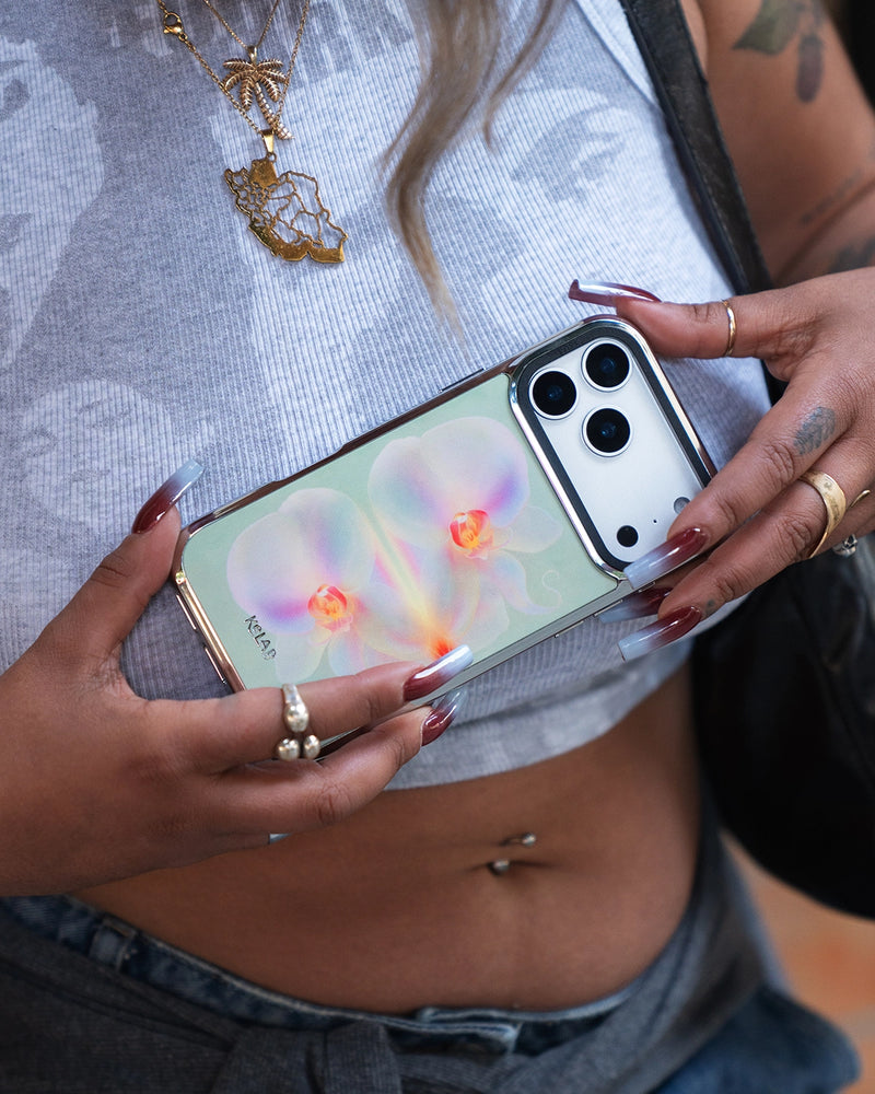
Pistachio Green Phone Case: The Newest Shade in the Edit
Pistachio is the green that doesn't announce itself. It's not the confidence of forest, not the restraint of sage. It sits closer to a botanical watercolor — pale, warm, slightly yellow-green — and it does something neither of the others can: it pairs with pink.
That's the idea behind Pistachio Rose. A soft pistachio base with scattered pink dots — a color combination that has no business working as well as it does. The green-pink relationship is unexpected and immediately editorial. It reads botanical without being obvious about it. Quiet, but with a particular point of view.
The pattern itself is worth noting. It's finer and denser than a traditional polka dot — closer to a textile weave than a graphic print. From a distance it reads as texture. Up close, the dots are deliberate. That dual quality is what makes it work across more contexts than a standard dot pattern would.

Pistachio Rose | Green Polka Dot iPhone Case — KELAB
Styling a pistachio green phone case works on the same principle as sage: restraint elsewhere. The difference is what you're restraining it next to. Pistachio reads its best against dusty rose, warm white, soft beige, and mauve — palettes that lean feminine without being precious. A pistachio green case against an all-cream or blush-toned outfit is the quietest possible color moment, and somehow the most deliberate-looking one.
It's also the most neutral of the three greens for skin tone. The yellow-green warmth reads flattering in hand against a wider range of complexions than the cooler sage or the deeper olive.
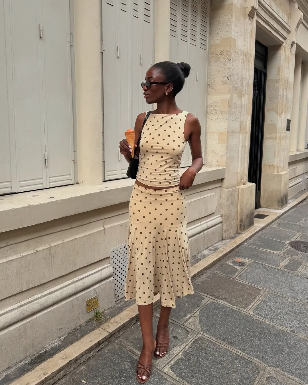
What To Wear With A Green Polka Dot Phone Case: 5 Outfit Formulas
The consistent rule: green polka dot cases work best when the rest of the outfit is simple. Let the case carry the pattern interest.
- Linen set + white sneakers. A sage green case extends the color story without effort — it disappears into the palette in the best way.
- Oversized cream knit + straight-leg jeans. Olive polka dot adds the one textural element the outfit is missing. It does the pattern work so nothing else has to.
- Trench coat + neutral everything. Olive against camel is one of the quieter but more considered color combinations. The dot pattern keeps it from reading plain.
- Soft pink or dusty rose set. Pistachio Rose was made for this. The green-pink relationship is unexpected and immediately editorial.
- White button-down + wide leg trousers. Classic base. The green case is the only thing with personality. That's the point.
Green Polka Dot Cases for iPhone 16 and iPhone 17: Green Options Worth Buying
If you're shopping for a green polka dot iPhone case for iPhone 16 or iPhone 17, a few specifics worth checking beyond the color:
- Camera cutout precision. The iPhone 16 Pro and 17 Pro camera arrays are larger than previous generations. A case that doesn't account for this accurately adds visual interference around the lens cluster. Look for cases designed specifically for your model, not converted fits.
- MagSafe compatibility. Apple's MagSafe ecosystem is a practical daily-use feature. A case without aligned N52 magnets won't attach to wallets, car mounts, or stands reliably. KELAB cases include the strongest consumer-grade magnets across the range.
- Print longevity. Embedded color holds up over 12 to 18 months. Surface prints don't. The case shouldn't look like a different case six months in.
- Raised edges. The iPhone 16 and 17 screens are flush with the frame. Raised lips around the screen and camera add meaningful drop protection without bulk.
Polka Dot Vs. The Other Prints Of The Season
Spring and Summer 2026 brought several prints back at once — gingham, stripes, romantic florals, and dots all competing for the same wardrobe real estate. They're not interchangeable.
Gingham is directional. It has a cottagecore gravitational pull that's hard to neutralize. Stripes carry a nautical or athletic read depending on weight and width. Florals are inherently romantic. The polka dot is the only one of the group that functions as a true neutral print — geometric enough to feel modern, round enough to feel approachable, and pattern-dense enough to be visually interesting without reading as busy.
That's the precise argument for a green polka dot case over any of the alternatives. It works harder in more contexts. The dot on your phone doesn't set the aesthetic of the whole outfit. It just quietly improves whatever's already there.
How To Read A Green Polka Dot Case Before You Buy
Color accuracy. A lot of green cases photograph differently than they arrive. The two common failure modes: reads too yellow (chartreuse drift) or too grey (sage washout). Look for product photography on a white background so you can calibrate the actual tone, not the lighting mood.
Dot scale and spacing. Tight, smaller dots read more textile and classic. Larger, spaced dots read more graphic and bold. Neither is wrong — they make different arguments. Know which one you're making.
Print longevity. A color that's embedded or in-molded holds up significantly better over 12 to 18 months than a surface print on clear. The case shouldn't look like a different case six months in.
Fit integrity. A case that barely clears a MagSafe charger or covers the speaker grille is a daily frustration, not a style choice. Precision cutouts for your specific model aren't a bonus — they're the baseline.
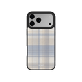
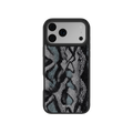
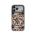
Shop The Polka Dot Series
Explore Collection


Stand out, quietly. The dot is doing the rest.
