
 ACCOUNT

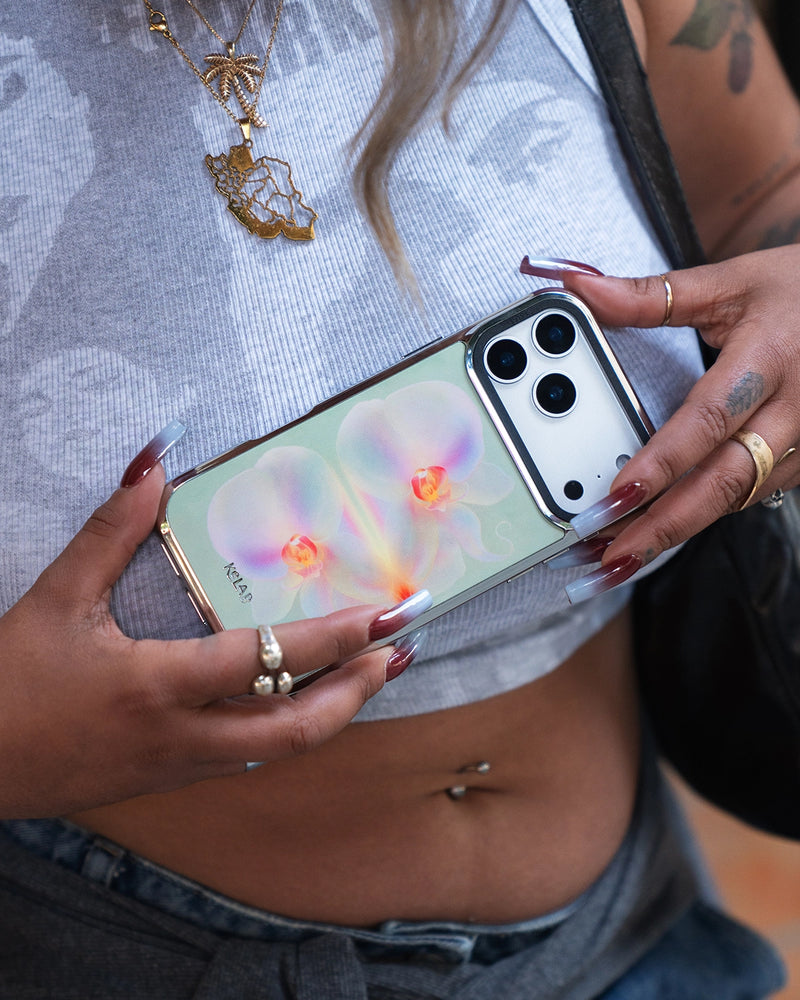
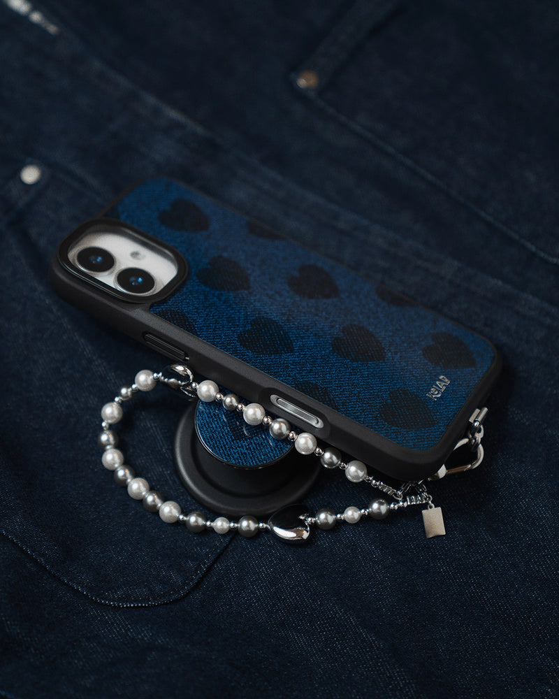
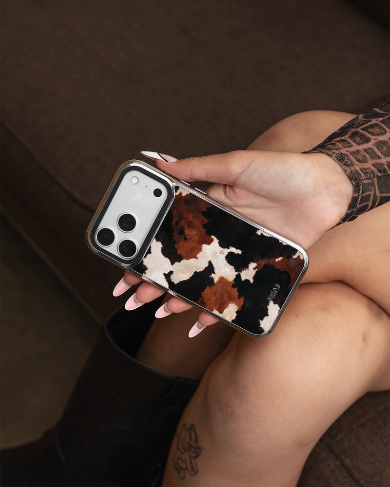
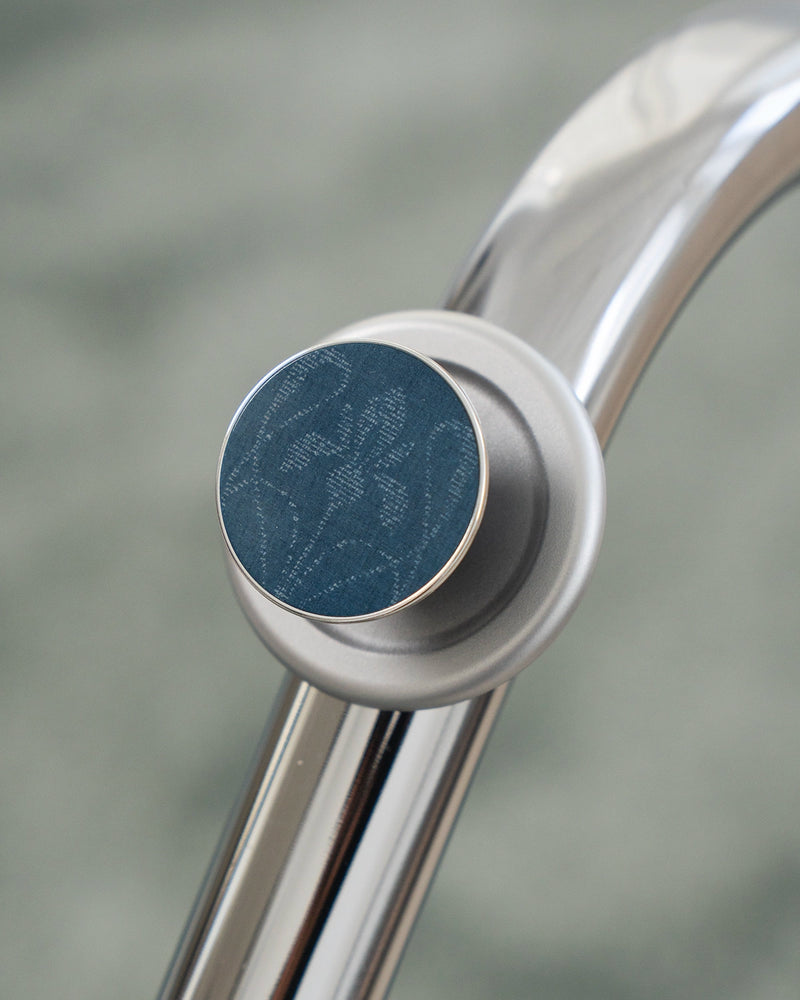
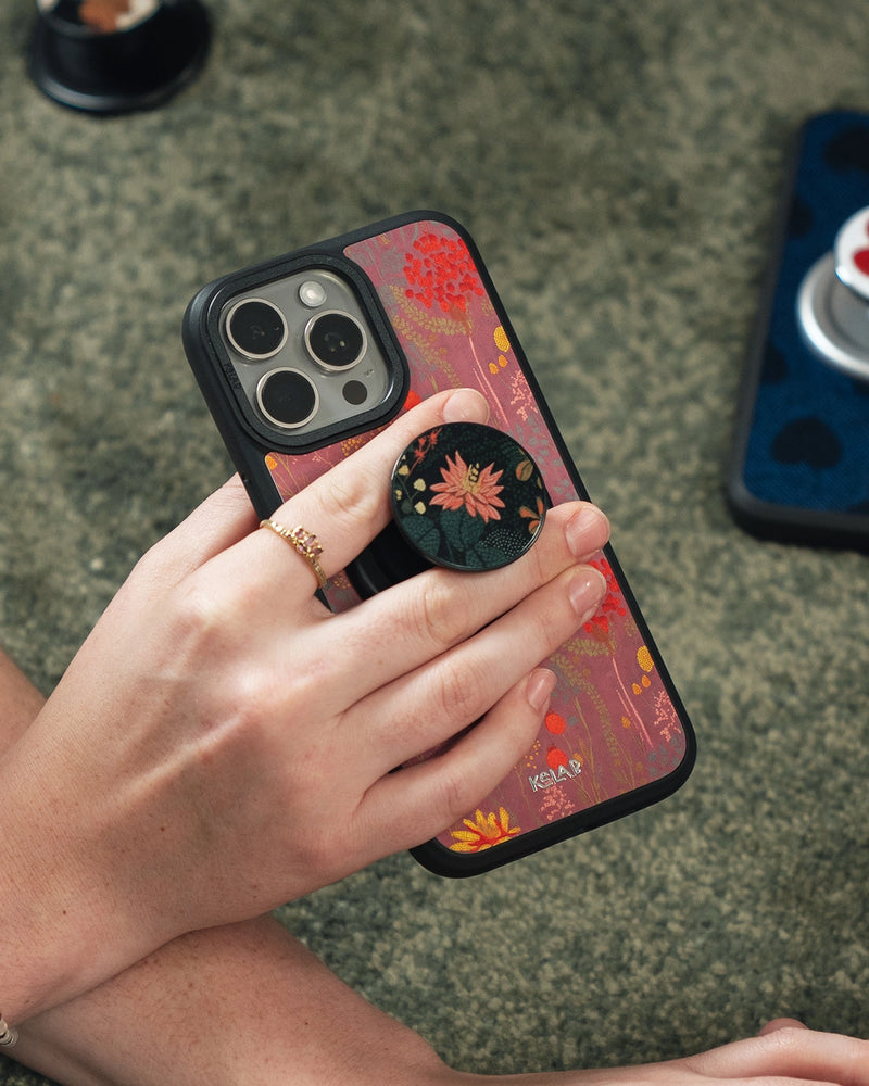
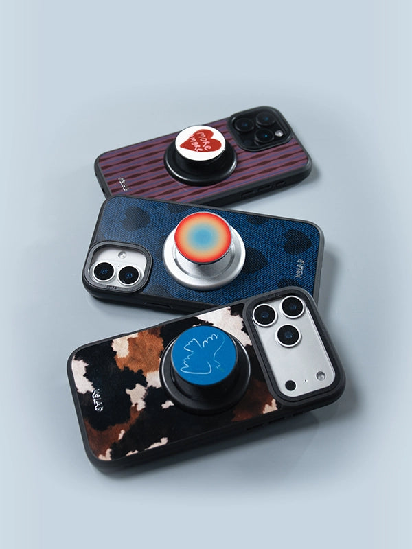

An aesthetic iPhone 17 Pro Max case is one chosen for how it looks first and how it protects second, without giving up either. In practice that means a considered color or an original print, a profile that respects the phone's proportions, and MagSafe that actually holds. These are six worth owning, grouped by the look they deliver rather than by drop rating.
At KELAB the whole idea is to help you stand out, quietly, so nothing here is loud for the sake of it. Every case below is cut specifically for the iPhone 17 Pro Max, comes in Tough, Bold and Bold Chrome, and is available with MagSafe built in, so the decision you are making is about the look rather than about whether the case will do its job. If you already know which finish your phone is, skip to matching a case to your phone color.
Quick Picks: Six Looks, One Phone
If you read one thing, read this. The rest of the guide is the reasoning behind it.
| If you want | Pick this | Shop |
|---|---|---|
| Black, but warmer | A single deep brown solid | Espresso |
| To never think about it | A warm nude that reads as a neutral | Toast |
| Texture, not print | A tonal burgundy wave | Mulberry |
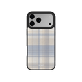
| Soft color, done seriously | A clean sky blue with no glitter | Cloud Pop |
| Print that behaves | Snakeskin rendered white on white | White Venom |
| To be asked about it | Zebra stripe on a dark base | Shadow Striker |
What Makes a Case Aesthetic?
An aesthetic case is designed around a specific visual point of view instead of a generic pattern library. The practical markers are a restrained palette, a print drawn rather than licensed, edges that follow the phone instead of adding bulk, and hardware that disappears. Protection is still expected. It just is not the headline.
The iPhone 17 Pro Max raises the stakes because it is a large phone with a wide camera plateau. A print that looks balanced on a 6.1 inch device can read as busy across this much surface, and a thick case makes an already tall phone harder to hold one-handed. Every pick below is chosen with that scale in mind. For the wider view across every pattern family, our aesthetic phone cases guide covers the full spread.
1. Espresso: For One Deep Neutral
Deep brown has quietly replaced black as the default serious neutral. It reads warmer against skin tones, it hides everyday marks better than a light solid, and it pairs with almost any strap, bag or watch band you already own. Espresso is a single saturated brown with a glossy finish, no gradient and no texture, which is the entire point.
This is the case to pick if you want your phone to look deliberate without anyone being able to name the brand from across a table.
2. Toast: The Nude That Reads as Neutral
Most nude cases drift pink or gray within a season of wear. Toast sits closer to a warm oat, which keeps it legible as a neutral rather than as a color. It is the easiest case here to live with if you change bags and outfits often and would rather not think about whether they match.
3. Mulberry: Texture Instead of Print
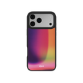
If a solid feels too plain and a print feels too loud, texture is the middle path. Mulberry is a burgundy wave that behaves like a tonal surface rather than a graphic. It catches light, it gives the back of the phone some depth, and it does not compete with anything else you are wearing.
Burgundy also does something useful at this size. Deep reds visually shorten a tall back panel in a way pale colors do not, which matters more on the Pro Max than on any other model in the range.
4. Cloud Pop: Soft Color, Done Seriously
Soft blue is the one pastel that does not read as juvenile on a professional-sized phone. Cloud Pop is a clean sky blue with no gradient and no glitter, which keeps it closer to a painted object than to a novelty case. It works particularly well against silver and white phone finishes, where a warm neutral can look muddy and a dark case can look heavy.
5. White Venom: Animal Print, Turned Down
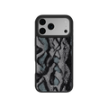
Animal print has a reputation problem that comes almost entirely from scale and contrast. White Venom is a snakeskin print rendered tonally, so the pattern is legible up close and reads as texture from across a room. It is the version of the trend you can carry into a meeting.
If you are still deciding between the animal prints on offer, our guide to leopard print versus cheetah print explains how to tell the common ones apart, and the snakeskin collection has the rest of the family.
6. Shadow Striker: Meant to Be Seen
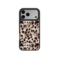
Not every case needs to whisper. Shadow Striker is a zebra stripe on a dark base with warm metallic tones rather than the usual hard black and white, which softens the contrast enough that it works as a daily case instead of a statement you get tired of by week three.
It is also the answer if what you are after is a dark aesthetic rather than a black case. A flat black solid disappears. A dark base with a pattern moving across it holds the same mood but gives the eye somewhere to go, which is the difference between a phone that looks unfinished and one that looks chosen. This is the pick if the rest of your carry is plain and you want exactly one object doing the work. More of the same energy lives in the zebra print and black collections.
Which One Should You Choose?
| Case | The look | Best against | Attention level |
|---|---|---|---|
| Espresso | Deep brown solid | Any phone finish | Low |
| Toast | Warm nude solid | Warm finishes | Low |
| Mulberry | Burgundy wave texture | Any phone finish | Medium |
| Cloud Pop | Sky blue solid | Silver and white | Medium |
| White Venom | Tonal snakeskin | Cool finishes | Medium |
| Shadow Striker | Zebra on dark | Dark finishes | High |
How Do I Match a Case to My iPhone 17 Pro Max Color?
The reliable rule is to either match the phone's undertone or oppose it completely. Half steps are what make a pairing look accidental. The iPhone 17 Pro Max comes in three finishes, and each one has an obvious answer.
| Phone finish | Safest pairing | The interesting one | Avoid |
|---|---|---|---|
| Cosmic Orange | Espresso, same warm family, deeper | Shadow Striker, dark base lets the orange edges read as a deliberate accent | Pink and coral, which fight the orange |
| Deep Blue | Toast, a warm neutral against a cool body | Mulberry, a full opposition that still reads as grown up | Another mid blue, which looks like a near miss |
| Silver | Cloud Pop, cool on cool | White Venom, tonal print on a neutral body | Warm beige, which can look muddy against silver |
Two notes worth knowing. Cosmic Orange is the finish people struggle with most, because it is saturated enough that a matching case ends up competing with it. Going deeper in the same warm family, or going fully dark, both work. Going adjacent does not. And on Silver, the case is doing all the color work, so it is the finish where a print earns its place.
If you would rather browse by color than by print, start with the blue, burgundy, beige, white and black collections.


