
 ACCOUNT

What decides how an animal print reads on the back of a phone is scale and contrast, not which animal it came from. Almost every guide to this gets it wrong because it is written about clothing, where a garment gives a pattern enough surface to average out into a field. A phone back is about six inches of flat panel. At that size a large, high contrast repeat becomes one graphic object, and a small, mid contrast repeat becomes texture, which is how a neutral behaves.
Classic zebra print is the first kind: wide bands in black and white, only a few of them per case, impossible to ignore. Classic leopard print is the second: dozens of small rosettes in warm mid tones that read as a single color field from arm's length. That is the real difference between them, and it is why leopard has been the default animal print for years while zebra has been the statement one. At KELAB the whole idea is to help you stand out, quietly, which is why our zebra is not the classic version of it. Skip to which one should you choose if you want the short version.
Quick Answer: Zebra or Leopard
| If you want | Pick | Start with |
|---|---|---|
| Stripes that behave like a neutral | Zebra print, tonal warm | Shadow Striker |
| Stripes with color instead of contrast | Zebra print, cool | Deep Sea Marble |
| The classic warm animal print | Leopard print | Golden Prowl |
| Spots that work with black and silver | Leopard print, deep | Dark Cherry |
Why Does the Choice Change on a Phone Case?
Fashion media has spent 2026 calling zebra the new neutral, and on clothing that holds up. Who What Wear and others have tracked it moving from accessory into coats and tailoring, taking the position leopard held for the last few years. A phone case does not work like a coat, for three reasons.
Pattern repeat against available surface. On a jacket a wide stripe repeats forty times and the eye averages it into a field. On a 6.3 inch phone back the same repeat gives you three or four bands. The pattern stops being texture and becomes a composition, so where each band lands actually matters. Shrink the repeat and the effect reverses completely.
Contrast does more work than color. Black against white is the maximum contrast pair available, and it is the reason classic zebra reads as loud rather than the stripes themselves. Render the same stripe in bronze and cream over black and the contrast ratio drops far enough that it reads as a textured surface instead of a graphic.
The camera island. Every modern case has a large asymmetric hole in one corner. A small repeat absorbs that interruption. A large directional pattern gets visibly cut by it, which is why some zebra cases look unbalanced while the same print looks fine on fabric.
So the useful question is not zebra or leopard. It is how large the repeat is and how far apart the tones sit.
How Does Zebra Print Read on a Case?
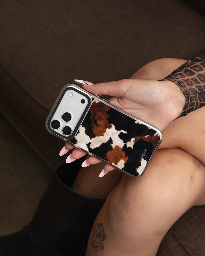
It depends entirely on which zebra. The mass market version, wide black and white bands, is the loudest thing you can put on a phone. It coordinates easily, because an achromatic print goes with anything, but it is always visible, and a phone spends much of its life face up on a table. Some people want exactly that. Some find it tiring by week three.
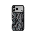
Shadow Striker is the other approach. The stripes are narrow, dense and brush textured, and they run in rose gold, bronze and cream over a black ground rather than in white. Two things follow from that. The repeat is small enough to behave as a field rather than a composition, so the camera island does not break it. And the palette is warm, so it sits with gold hardware, tan leather and cognac the way a leopard print does, not against them.
It is, functionally, a zebra that behaves like a leopard. If you like the idea of stripes but have avoided them because every zebra case you have seen is a black and white statement, this is the version worth looking at.
Deep Sea Marble takes the third route: keep the stripe geometry, drop the contrast, and let color carry it. A marbled teal reads cool and tonal, which makes it the one to pick if your carry is silver, steel and denim rather than gold and leather.
How Does Leopard Print Read on a Case?
Textural and warm, almost regardless of colorway. Because the rosettes are a small repeat, the eye reads the whole panel as one color field rather than as individual shapes. At arm's length a brown leopard case reads as warm brown with something going on, which is functionally how a neutral behaves.
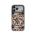
That is why leopard has been the safe default for years, and it is the same mechanism that makes Shadow Striker work. Golden Prowl is the classic execution: warm brown rosettes at a small scale, the print doing texture rather than announcement.
The warm palette is the constraint rather than the scale. Brown and tan leopard sits well with camel, cognac and gold, and less comfortably with cool grays and silver. Dark Cherry solves that with a deeper wine base and tonal plum rosettes, which pairs with black and silver instead of fighting them. It is the leopard equivalent of what Deep Sea Marble does for stripes.
Zebra Print vs Leopard Print: Side by Side
The category defaults first, since this is what you will find almost everywhere else.
| Classic zebra | Classic leopard | |
|---|---|---|
| Pattern repeat | Large, 3 to 4 bands per case | Small, dozens of rosettes per case |
| Contrast | Maximum, black against white | Medium, warm mid tones |
| Reads at arm's length as | One graphic object | A textured color field |
| Camera island tolerance | Lower, the cutout breaks the band | Higher, the repeat absorbs it |
| Pairs with | Anything, it is achromatic | Camel, gold, cognac, cream |
| Attention level | High | Low to medium |
| Main risk | Visual fatigue over time | Reads as a safe default |
Now the same two axes applied to the actual designs, which is where the category rule stops predicting the answer.
| Design | Repeat | Contrast | Temperature | Behaves like |
|---|---|---|---|---|
| Shadow Striker | Small | Medium | Warm | A neutral |
| Deep Sea Marble | Medium | Low | Cool | A color |
| Golden Prowl | Small | Medium | Warm | A neutral |
| Dark Cherry | Small | Low | Cool | A deep solid |
Which One Should You Choose?
Three questions settle it, and none of them are about which animal you prefer.
How much attention do you want the phone to draw? Low means a small repeat at medium or low contrast, which describes Shadow Striker, Golden Prowl and Dark Cherry alike. High means a large repeat at maximum contrast, which is the classic black and white zebra you will find outside our range.
Is your everyday carry warm or cool? Gold jewelry, tan leather and cream knitwear point to Shadow Striker or Golden Prowl. Silver, steel, black and denim point to Deep Sea Marble or Dark Cherry. This is the question that matters most, and it cuts across stripes and spots rather than along them.
What animal print are you already carrying? If you own a leopard bag or leopard shoes, a leopard case creates a matching set that reads more coordinated than intended. Stripes break it up while keeping the same warmth, which is exactly what Shadow Striker is for.
Does Model Size Change the Answer?
It changes the large repeat answer and barely touches the small repeat one, which is the scale argument working in practice.
A classic wide band zebra needs a large back to complete rather than crop, so it looks best on an iPhone 17 Pro Max or a Galaxy S26 Ultra and gets awkward on an iPhone 16 or a standard Galaxy S26, where the camera island takes a larger proportional bite out of fewer bands.
Everything in our range sidesteps that, because the repeats are small enough to fill any back panel as an even field. Shadow Striker looks the same on an iPhone 13 as on an S26 Ultra. If you change phones often and want to keep the design, a small repeat is the lower risk choice whichever animal it came from.
Does the Finish Change How Each Print Reads?
Yes, and more than most people expect. A glossy surface raises perceived contrast, because specular highlights sharpen the edge between light and dark areas.
The practical consequence is that gloss pushes every print one step louder than it looks in a flat photograph. A design already at maximum contrast gets harsh. A design at medium contrast gets depth. That is a reason to be careful comparing animal prints from product photos, where lighting is doing the same thing unevenly across brands.
Every Print, Every Device
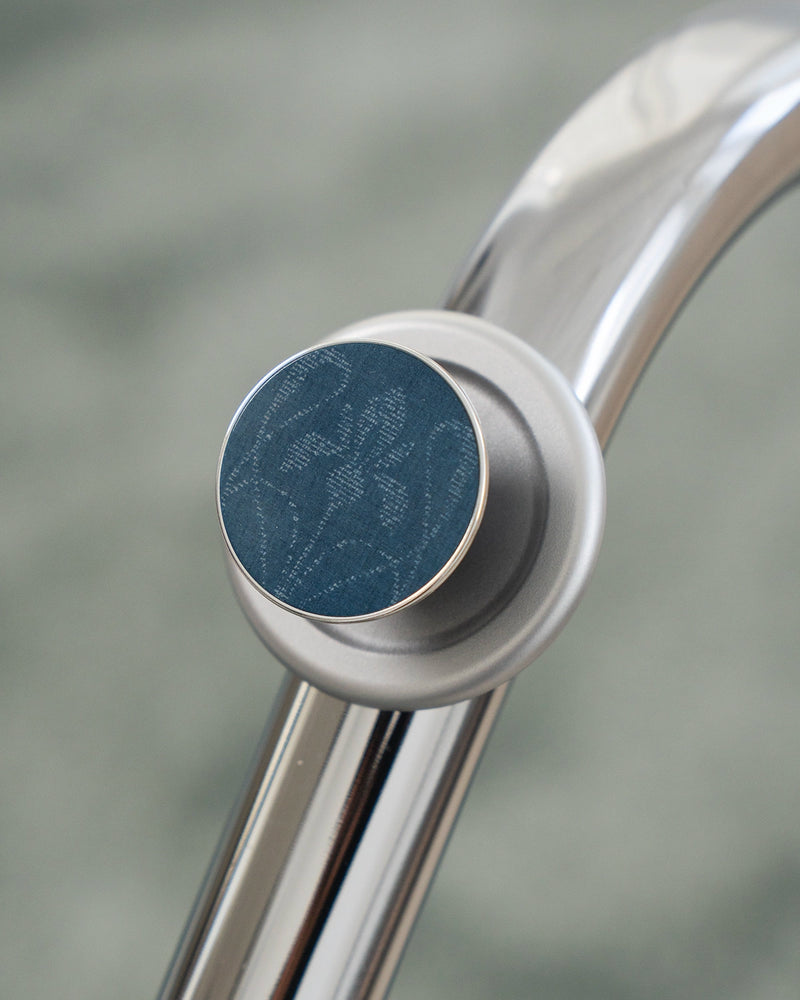
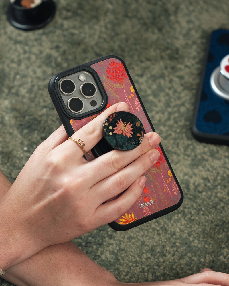
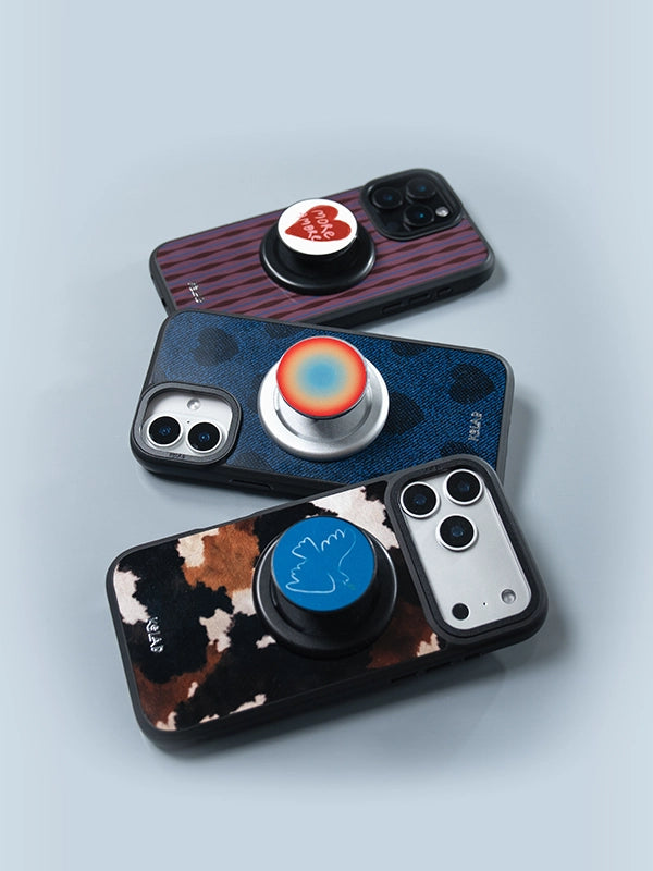
Whichever way you go, the design is not limited to your phone. Every KELAB pattern runs across the full lineup, so the same print exists as an iPhone case, a Samsung Galaxy case, an AirPods Max case and a MagSafe grip. That matters for this particular decision, because stripes and spots are the two prints people most often want to carry as a set.
The grip is also the cheapest way to find out whether you actually like a print before committing to a case in it, which is the logic covered in our guide to pairing a grip with your case.
| Design | iPhone | Samsung | AirPods Max | Grip |
|---|---|---|---|---|
| Shadow Striker | Case | Case | Cover | Grip |
| Deep Sea Marble | Case | Case | Coming soon | Grip |
| Golden Prowl | Case | Case | Cover | Grip |
| Dark Cherry | Case | Case | Cover | Grip |


