
 ACCOUNT

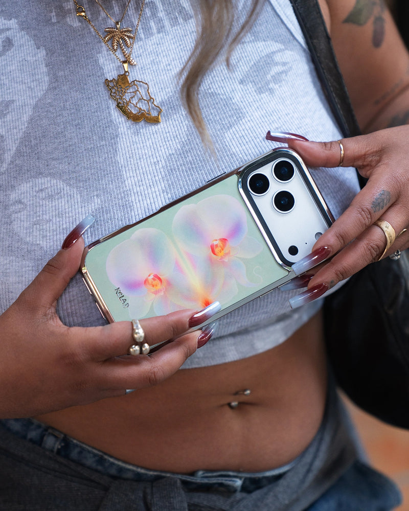
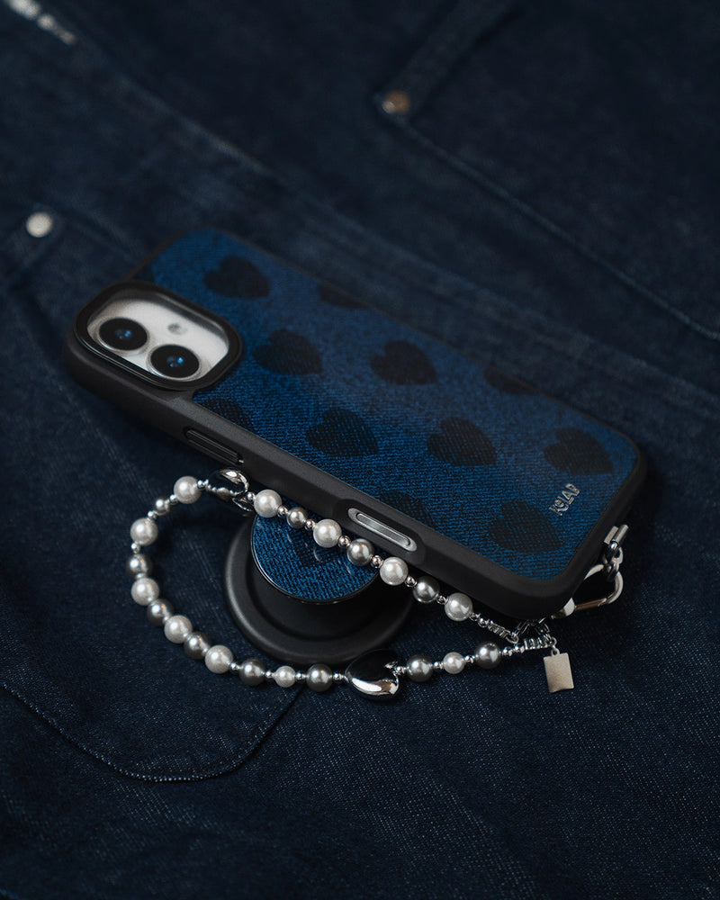
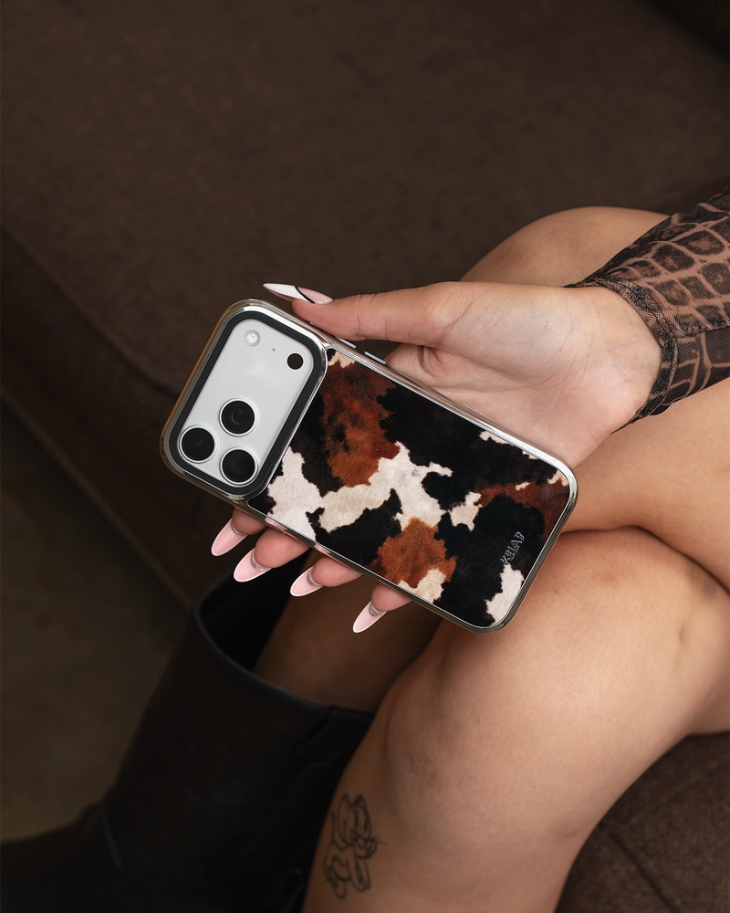

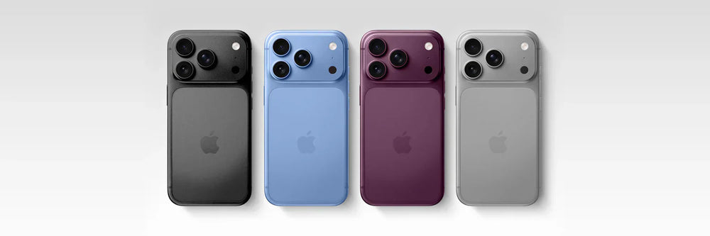
The simplest way to match a phone case to your iPhone is to work with its color, not against it. You have three moves: go tonal (a case in the same color family), go neutral (black, clear or cream that lets the phone lead), or go contrast (a color or finish that deliberately pops against it). Once you have picked the move, the finish, matte, glossy or mirror-bright chrome, does the rest. This guide walks through all three, then points you to the right shortlist for your exact iPhone color.
In this article
- What case color goes with your iPhone?
- The three ways to match: tonal, neutral, contrast
- When to choose a clear case, and when not to
- Matte, gloss or chrome: matching the finish
- Match by iPhone color family
- Does this still work for older iPhones?
- FAQ
What case color goes with your iPhone?
Any color can work, but the easiest wins follow a simple rule: pick a case that either echoes your iPhone's color or cleanly contrasts it, and avoid the awkward middle ground of a near-miss shade. A tonal case in the same family reads as intentional. A neutral case steps back and lets the phone be the color. A contrast case makes a statement on purpose. Trouble only shows up when a case is close to the phone's color but not the same, which reads like a mistake rather than a choice.
The three ways to match: tonal, neutral, contrast
Every good pairing is really one of three approaches:
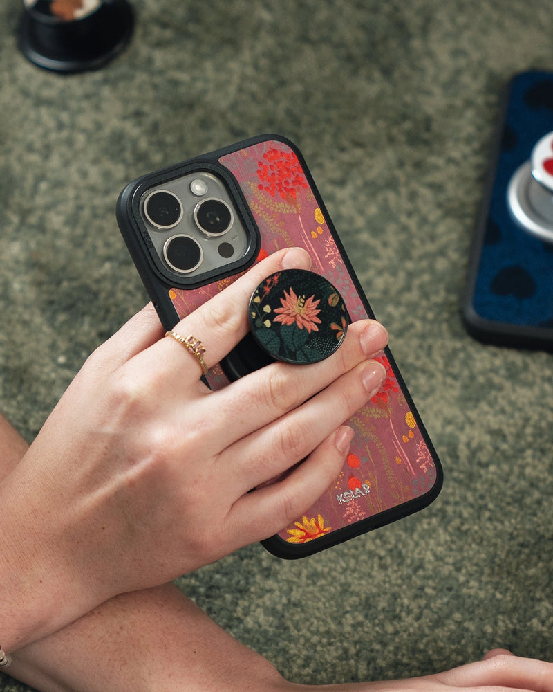
- Tonal. A case in the same color family as the phone: a burgundy case on a wine-red iPhone, a sky case on a light blue one. It looks considered and cohesive, and it is the safest place to start.
- Neutral. Black, clear, cream or gray. The case recedes and the phone's own color leads. Best when you want protection without changing the phone's look.
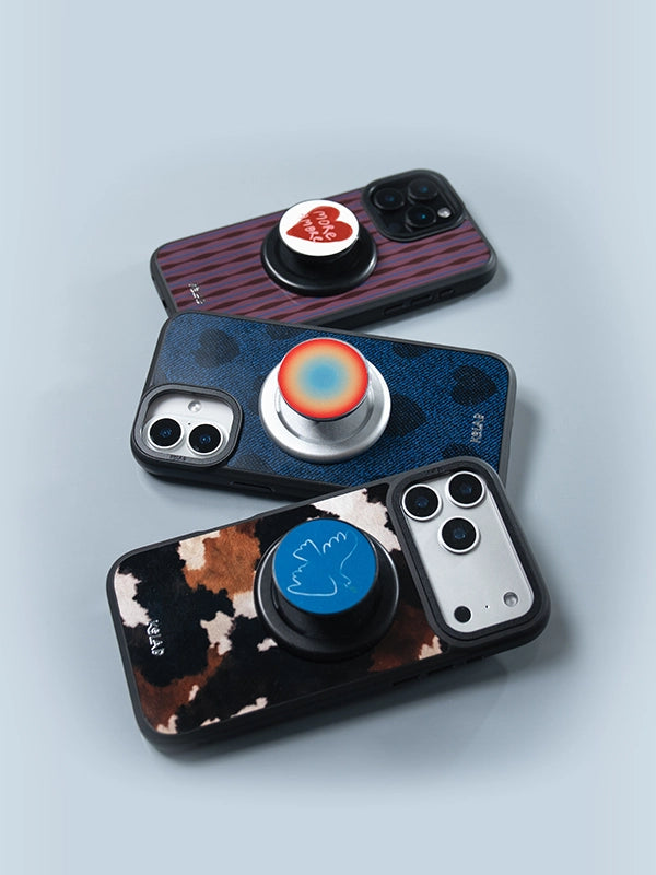
- Contrast. A deliberately different color, or a bright finish like chrome, set against the phone. This is the boldest move and the one that turns heads. It works best when the contrast is clearly intentional, not accidental.
There is no single right answer here; it depends on whether you want the phone to disappear into the case, peek through it, or play off it.
When to choose a clear case, and when not to
A clear case is the move when you actually like your iPhone's color and want to show it off, especially a special finish you paid a little extra for. It is the ultimate neutral: full protection, zero color change. The catch is that cheaper clear cases can yellow over time, so the finish and material matter more than with a colored case. If your phone color is the whole point, go clear. If you would rather change the phone's look day to day, a colored case gives you more to play with.
Matte, gloss or chrome: matching the finish
Color is only half of a pairing. Finish is the other half, and it changes the mood as much as the hue does:
- Matte: soft and understated. It calms a glossy phone and keeps a tonal look quiet. The everyday, "stand out quietly" choice.
- Glossy: brighter and more reflective, so colors read deeper and more saturated.
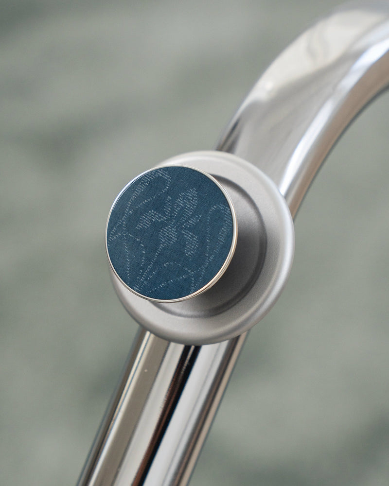
- Chrome: an electroplated, mirror-bright finish. It reads more like jewelry than a case and pairs especially well with jewel tones and deep, rich colors. This is contrast as a finish, not just a color.
A useful shortcut: match a metallic or chrome case to a deep, saturated phone color for a luxe contrast, and keep matte for when you want the whole thing to stay low-key. You can see the difference across the range in our Chrome iPhone cases and the matte Bold series.
Match by iPhone color family
Here is where to start for each of the current iPhone 18 Pro colors. Each shade has its own shortlist as we build them out.
- Dark Cherry: a deep wine red. Go tonal with burgundy, maroon or oxblood, or contrast with chrome. See our full guide to the best cases for the Dark Cherry iPhone 18 Pro.
- Light Blue: soft and cool. Tonal sky and powder blues keep it calm; a warm contrast like clay or rust makes it pop. See our full guide to the best cases for the Light Blue iPhone 18 Pro.
- Silver: clean and neutral. Almost anything works, which makes it the best base for a bold contrast case. Shortlist coming soon.
- Dark Gray: the quiet all-rounder. Tonal charcoal reads sleek; chrome or a single bright color lifts it. Shortlist coming soon.
Prefer to shop by the case color rather than the phone? Our color guides go the other way, starting from the shade of the case itself, like our teal cases and brown and earth-tone edits.
Does this still work for older iPhones?
Yes. The three moves, tonal, neutral and contrast, are about color relationships, not a specific model, so they apply to any iPhone and any future one. The only thing that changes year to year is the palette Apple ships. Find your phone's color, decide whether you want it to blend, recede or pop, and the rest of the choice falls into place. When a new lineup lands, the same logic carries straight over.
Frequently asked questions
Should a phone case match or contrast the phone color?
What case color goes with everything?
Do clear cases turn yellow?
What finish looks best on a deep-colored iPhone?
Find your color
Tonal, neutral or contrast, in matte Bold or mirror Chrome. Shop cases that suit your iPhone.
Shop iPhone cases →


